Guild icon
The Wolf3D.net Discord
GameDev / artistry / Art Lecture 3
Avatar
Welcome to the third art lecture! This time we'll be making some decorated text with gradients, shadows, 3D effects, and the like. (edited)
1:37 am
If you would like, please post any screenshots of decorated text effects that you have seen, for examples of what you would like to do.
1:37 am
Avatar
I'm here.
Avatar
Here
1:38 am
Avatar
Very nice. Do you want to apply some further effects onto this?
Avatar
How easy is it to duplicate the look of the wolfenstein font? I mean the color gradations?
Avatar
Shouldn't be hard?
1:39 am
@Aurora Yeah, I would like to make it look fancy.
Avatar
Avatar
WayneCa
How easy is it to duplicate the look of the wolfenstein font? I mean the color gradations?
It is a matter of setting up a gradient the way you want it:
Avatar
I'm not very knowledgeable on fonts.
Avatar
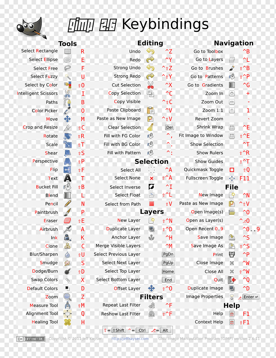
It depends on whether your program has a tool for gradients or not; if not, then you may just copy this and stretch it as you like, to use with the course;
Avatar
Well, to start, Wolfenstein's typeface (that's the term they taught me in art school) is part of a family called Blackletter.
1:41 am
Sorry. I'm not the teacher here.
Avatar
I can do gradients with gimp, just never tried to before.
Avatar
I never quite found which font it was, or if it was a homebrew one drawn by an artist at ID. I decided Dampfplatz works well enough for me. https://cdn.discordapp.com/attachments/1018823565564448798/1018939603983532212/DampfPlatzs.ttf
Avatar
There's actual a whole history of which particular blackletter fonts the nazis knew about and encouraged everyone to use in WWII.
🤔 1
Avatar
I was actually thinking of use the color gradations on the ASAR text on the logo.
Avatar
It is not the same font, but it is a similar blackletter one
Avatar
I believe there was one they banned.
Avatar
But using the same font I used for that text.
Avatar
The very first thing we need is a transparent empty image, with dimensions large enough to fit your text.
Avatar
I'll open gimp.
Avatar
If you have an existing image, please crop the text from it and make a new image. There shouldn't be too much empty space around the letters
Avatar
I just need the "3D" part of my logo. Might use the font you uploaded.
1:46 am
To visually reference Wolf 3D.
Avatar
Either create the text on the empty layer, or isolate the text you wish to add effects to via color selection or such, deleting the rest of the image.
1:48 am
Feel free to post screenshots of your progress here, so I know we're all on the same page
Avatar
I am still remembering how to use gimp. It will take me a few minutes.
Avatar
Avatar
adanior
Click to see attachment 🖼️
Dampfplatz seems to have awkwardly sized number letters. I might recommend adjusting the size,, although I suppose that looks quirky in a way and could work.
1:53 am
For a crude 3D effect, you could copy the text layer (in PSP9, right click and Duplicate) (edited)
1:54 am
And then move the copy down and right by 1 pixel.
1:54 am
Darken the copy - notably. I applied -50 to the brightness.
1:56 am
Then repeat the process. Duplicate the darkened image layer you just created, and move it to the bottom. This time, drop the brightness by a smaller amount, let's say -10.
1:56 am
You can keep repeating this process many times to get a deeper 3D effect.
1:57 am
What I do at this point, to speed up my work, is to combine the two darkened layers I just created. I merge them into one.
1:58 am
Then, I create a duplicate from this merged layer. Instead of moving this duplicate by 1 pixel down-right, I move it by 2 pixels. I darken it by twice the amount, -20.
1:58 am
After moving but before darkening
1:58 am
After darkening
1:59 am
I can repeat the step to speed up my work even more to create a super deep 3D effect...
1:59 am
2:00 am
2:00 am
It's a pretty neat effect for being basically just copy-pasting, darkening, and shifting the image.
Avatar
I just realized that I don't remember what fonts I used.
2:02 am
I'm working at a lower resolution so I didn't need to do this as much.
Avatar
I like the fact the 3-D is going to a different direction there. I would make the gray part of the gradient brighter near the top, though.
Avatar
Okay.
Avatar
This is a matter of personal taste only, but I might add a bit more depth to the 3D effect too. A few more pixels/copies.
2:06 am
If you wanted to add a neat bevel effect, but without actually using the crude bevel filters offered by PSP and Photoshop, you could do it using shadows. I select the main, topmost text layer, and select the visible pixels. In PSP9 you can do this via Select All (Ctrl+A) and then Float (Ctrl+F). Finally I invert the selection (Ctrl+Shift+I).
Avatar
OK, I found it. Now I need to work on first reducing the blur.
2:08 am
Avatar
At this point, create a new layer for the bevel/shading effect. Every image editing program should come with a shadow tool. Use it to apply a white shadow that falls one pixel down-right.
2:10 am
Then a black shadow going the opposite way.
2:10 am
You can configure the strength of the effect here.
Avatar
OK. I have the text still in text mode, so should I position it and go to image mode before I do that?
Avatar
You should clear the part of the image that isn't the text
2:11 am
And resize the canvas so it mostly just covers the text.
2:12 am
At the end of this, you should be in image mode, with text on a transparent background, just fitting on the canvas nicely.
2:13 am
My text looked better without the dark shadow I added for the 'bevel effect', so I left just the bright one. (edited)
Avatar
OK. I have to start over with this. I am having to remember how to do everything and I am getting slower every year. (edited)
Avatar
No problem. I won't leap ahead too much here.
2:14 am
Only white part of bevel layer applied. It's kinda cheap, but a nice effect for so little work
Avatar
I'm just playing around with filters at this point. I find it does my idea as much justice as it deserves.
2:15 am
Might do something with the "Super" part of the logo.
Avatar
I'd make it bigger
Avatar
I thought I got the idea for the little hand-written "super" from Street Fighter 2, but it turns out they did something completely different. Maybe it was Super Ghouls 'n' Ghosts?
2:17 am
Yeah. I'll try and do that. Maybe use an actual font for it and rotate it.
Avatar
I might also copy the 3D text once horizontally to patch up the see-through pixels.
Avatar
That too
Avatar
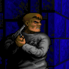
and add the kind of shining edge I did on my example, but only on the 3D text part. Even brighter than seen in mine, seeing as you want to do a Wolf 3D style thing
2:20 am
I had the idea for another kind of 3D effect, so I'll demonstrate it.
Avatar
I'm just going to make some coffee. Be back when I'm back.
2:21 am
2:21 am
Layer duplicated
2:22 am
Select all, float, and invert to select only the transparent pixels.
2:23 am
Doing the same trick, applying a bright-colored shadow to create a bright edge on the top-left side of the text
2:24 am
And darker on the opposite side
Avatar
OK here's where I am.
2:25 am
Avatar
Alright.
2:25 am
Now you're ready to add effects. What kind of effects do you want to add?
Avatar
I want to reduce the blur and make it raised slightly.
2:27 am
I think it's called embossed?
Avatar
I wouldn't know how to reduce the anti-aliasing in GIMP. Do you want no anti-alias at all?
Avatar
Slight is ok, just not as much as it is currently. (edited)
Avatar
Are you able to select the text, so the selection borders just the visible pixels?
Avatar
There is a sharpen item in the select menu.
2:29 am
I can try.
Avatar
I don't know if the sharpen will help here, since it's on a transparent background. I think it'll sharpen brightness differences, not the difference between transparency levels.
2:30 am
We'll do it another way
2:31 am
There may be some more proper way of increasing the contrast of transparent layers (in effect, lessening the anti-alias effect on the text), but I wouldn't know about how to do it in GIMP.
2:32 am
Instead, I'd like you to simply try selecting the text. Then invert the selection, and keep hitting delete a few times.
Avatar
I am having trouble getting free select to work.
Avatar
I was going around trying to center the contents of a png image with anti-aliasing, and I imported the image into GIMP - but then I realised I didn't know how to select all the non-transparent pixels
Avatar
I am going to read help and see if I can get the free select to work.
Avatar
The first replies here detail how to accomplish the selection in GIMP
Avatar
ok, thanks
Avatar
use the Color selector, set Select by: Alpha, check Select transparent areas and set the threshold to 0. Then click on the layer's background. This will only select the fully transparent pixels. Select > Invert and you have the selection that you originally sought.
2:35 am
However, don't set threshold to 0. Set it a bit higher, so you grab some of the blurry pixels around the edges of the text.
2:35 am
Then you can delete those
Avatar
OK I have the text selected.
2:37 am
Invert the selection and hit delete a few times?
Avatar
Just once, I think. The selection edge is absolute.
Avatar
There's no partial selections
2:37 am
At least as far as I understood from what that site said
Avatar
Okay. I'm back. That took way longer than expected.
Avatar
I inverted the selection and hit delete and all of the text was deleted. (edited)
Avatar
Well, it might have already selected the transparent area, so maybe don't invert it
2:39 am
Yes, I think the invert step should have been skipped, I neglected to say
Avatar
Avatar
Aurora
And darker on the opposite side
Going back to this for a bit; once you have applied shadows on the duplicated text layer as demonstrated here; you can start creating the effect I mean...
2:41 am
Copy this shaded layer 4 times, so you have a total of 5, (+6th, the original text. We don't care about that right now)
2:41 am
And move each to different direction - left, right, up, down, by 1 pixel. Keep the un-moved, first, shaded layer as the top layer. (edited)
Avatar
I am now trying to remove the selection so I can see what it looks like, but I don't remember how.
Avatar
Avatar
WayneCa
I am now trying to remove the selection so I can see what it looks like, but I don't remember how.
Avatar
OK I got it. It looks better. I want to try reducing it a little more. Try to get this down so I don't forget it so fast.
Avatar
What you can do now to reduce it further, is to duplicate the text layer.
2:44 am
The remaining text, which you did not delete anything from, still has some transparency around the edges.
2:44 am
So to lessen that, you can do the opposite - by making the transparent areas thicker.
2:45 am
And you can do that by copying the image over and again. Whichever method of copying the image over itself works.
Avatar
OK This is perfect. Actual size.
2:46 am
2:46 am
Now to emboss it. What do I do?
Avatar
Select all and float selection using Shift+Ctrl+L in GIMP
2:48 am
Not using GIMP so not sure if that works, but try it
Avatar
OK selected and floated.
2:50 am
Create a new layer
2:50 am
You'll create the shadow/emboss effect on that layer
Avatar
Do I put the new layer above or below the current layer?
Avatar
Above
2:52 am
OK done.
Avatar
Now invert the selection, so that only the outside area is elected
2:52 am
And go to filters->light and shadow->drop shadow (PSP9 would be effects ->3D->drop shadow)
2:53 am
1px horizontal, 1px vertical, white color, 0 blur.
2:53 am
Then repeat the step, but -1px, -1px, and black.
Avatar
oh dear, i am late
2:58 am
time to read up real quick
Avatar
I am not getting the effect I want. The text doesn't look raised.
3:01 am
3:01 am
I applied the effect 5 times.
Avatar
I'm seeing your background layer selected
3:03 am
So you're probably applying the effect on that, rather than the top one
Avatar
That's only because I increased the opacity on that layer so I could see what it looks like. I do the work on the top layer with the background layer totally transparent.
Avatar
Then something has gone wrong.
3:04 am
Unfortunately here I'm running to the limitations of my knowledge about other software.
Avatar
It's OK. I can keep playing with it now that I have a clue.
Avatar
Thanks for helping me get this far.
3:05 am
How strong was your opacity?
3:06 am
I don't know what the clipping option does, perhaps it's that.
Avatar
Avatar
WayneCa
Click to see attachment 🖼️
Your blur is too high.
3:07 am
Should be 0. (edited)
Avatar
OK, with the settings I used the opacity changed to 100.0000
3:08 am
3:08 am
I changed the color from white to the lightest yellow because white made it look strange. (edited)
3:10 am
I just noticed grow shape and grow radius. Maybe those have something to do with it.
Avatar
Avatar
Aurora
Copy this shaded layer 4 times, so you have a total of 5, (+6th, the original text. We don't care about that right now)
You could always just leave it white, but just decrease the effect by adjusting the layer's transparency level.
Avatar
this is what i got so far
Avatar
Anyway, continuing from my other text effect idea. What I've done here is select the text, and invert the selection. Then apply a bevel effect, by first adding a white drop shadow, going 1 pixel down-right. And a darker color shadow, going 1 pixel up-left. Then I have copied this shaded text layer, creating 4 more copies. And moved them underneath the original, to the bottom. I have moved each copy to a different direction, by 1 pixel. Left, right, up, down.
3:13 am
Then I will merge these 5 images/layers into 1 layer.
Avatar
That is more what I'm looking for. I will try that. (edited)
Avatar
...and repeat the process
3:14 am
Always moving the original copy to the top of the layer hierarchy, and then shifting the image in the four copies underneath it, one left, one right, one up, and one down by 1 pixel.
Avatar
OK that is complicated. I have to reread this multiple times until I can wrap my head around it. Graphics and art have never been my strong suit.
Avatar
I turned the process into a script so I could easily repeat it.
Avatar
Avatar
WayneCa
OK that is complicated. I have to reread this multiple times until I can wrap my head around it. Graphics and art have never been my strong suit.
Take your time, I'll help.
Avatar
So I have to create a new layer for each time I add the drop shadow?
3:18 am
You create only one shaded image.
3:18 am
Applying the shadow twice - one light, one dark.
3:18 am
After that it's just copying the layers, moving them, merging them, and copying again.
3:19 am
My effect, a bit more refined
Avatar
wait
Avatar
OK. I still have to understand how to add the light and dark on opposite sides of the text.
Avatar
is the effect done
👍 1
3:19 am
like is this effect been palleted?
3:19 am
i couldn't find the word i apologize
Avatar
Avatar
WayneCa
OK. I still have to understand how to add the light and dark on opposite sides of the text.
Here it is with a palette applied
3:21 am
I'll have to conclude the art lecture here, unfortunately. We can return to this later. I'm preparing to begin the coding lecture.
Avatar
I am using the wolf3d palette on it as I work on it. Changing palettes afterward doesn't work well for me.
3:21 am
Cool.
Avatar
this is what i got so far
Avatar
Avatar
Redead-ITA
this is what i got so far
That was a pretty neat effect by the way. I liked that
Avatar
That looks good, redead
Avatar
thanks
Avatar
I will keep playing with mine and I will post here when I have it figured out.
3:22 am
I'm heading over to coding now.
Avatar
here is the full image
3:23 am
i used a really smaller pallete here
Avatar
Did you do the dithering by hand?
Avatar
Thank you for the lecture
Avatar
the dithering is manual
3:35 am
i used aseprite
Avatar
Nice work.
Avatar
Avatar
Aurora
It is a matter of setting up a gradient the way you want it:
What program do you use?
11:25 am
I use GIMP, MS Paint, and Chaos Edits in app GFX editor
11:26 am
Haven't used that lovely new editor yet.... If I'm going to re input all my mapdefs I'm just going to convert my engine first from sdm to sod, made enough demos next will be full length or damn near.
Exported 206 message(s)
Timezone: UTC+9.5